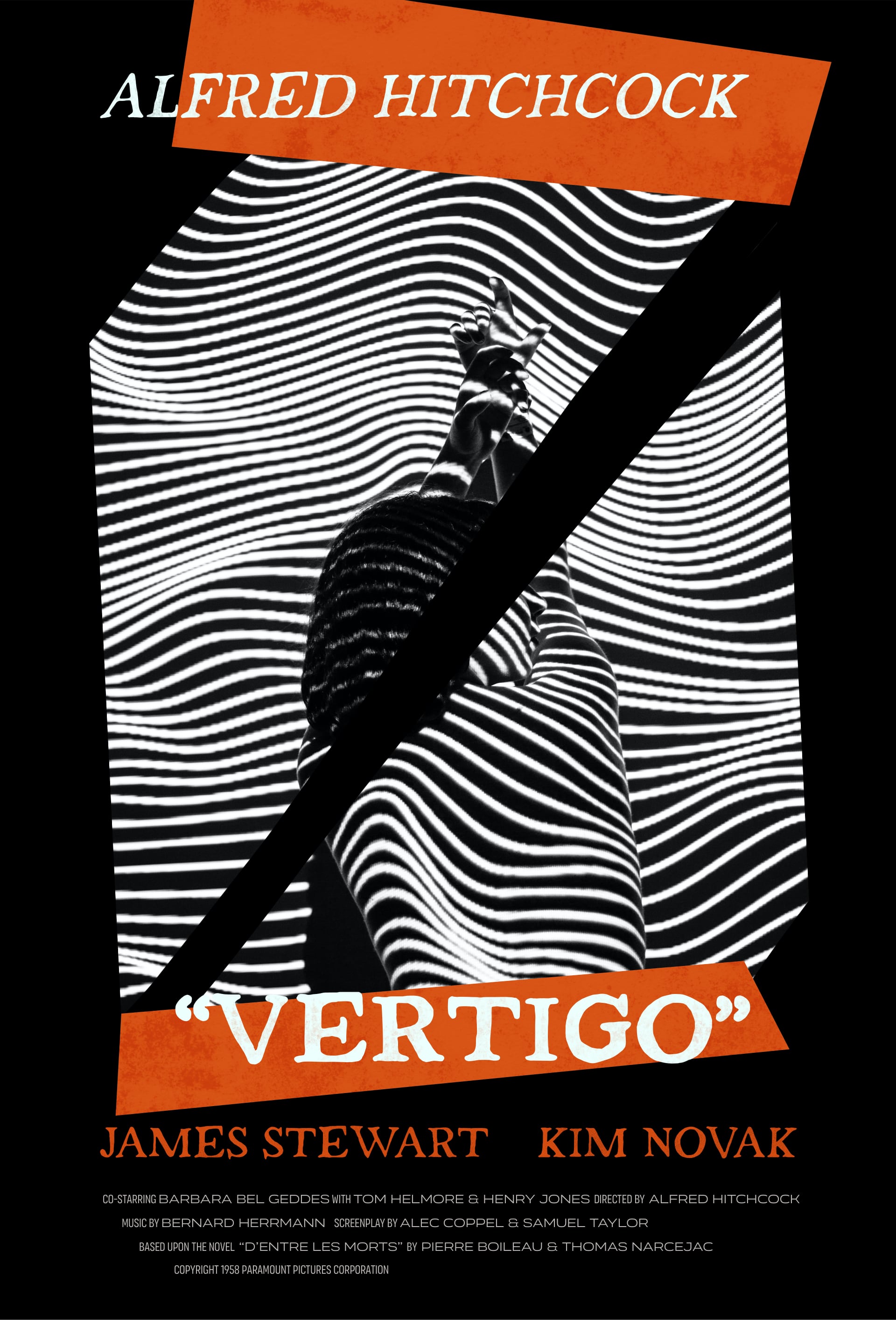
This design started with this gorgeous photo by Unsplash user liane. It was absolutely crying out to be turned into a Vertigo poster.
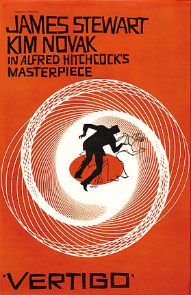
Anyone who’s seen the film’s iconic original poster design by Saul Bass will recognize the stark colors and disorienting lines that draw the viewer deeper in, as well as the severe, gritty lettering that suggests instability.
Inspired by the original, I started out with PintassilgoPrints’s font Strange Times, which had the kind of erratic, hand-painted quality I was looking for.
I skewed and tilted the orange shapes to add to the sense of disorientation. I painted a diagonal slash down the main image, which both leads the viewer’s eye down to the film title and partially obscures the model’s face, making her seem more ambiguous and echoing the movie’s themes. Finally, I went over the main text and orange shapes with a brush to add a mottled, more organic texture.
The credits are set in two different widths of Latinotype’s extremely versatile Organetto family. While you’re there, why not listen to Bernard Herrmann’s stunning soundtrack if you haven’t already? I promise you’ll love it.