Overview
- Project Type
- Event program cover design
- Client
- Seattle Youth Soccer Association (SYSA)
- Tools
- Adobe Illustrator
- Deliverables
- Print-ready design, 850 printed programs
Project Overview
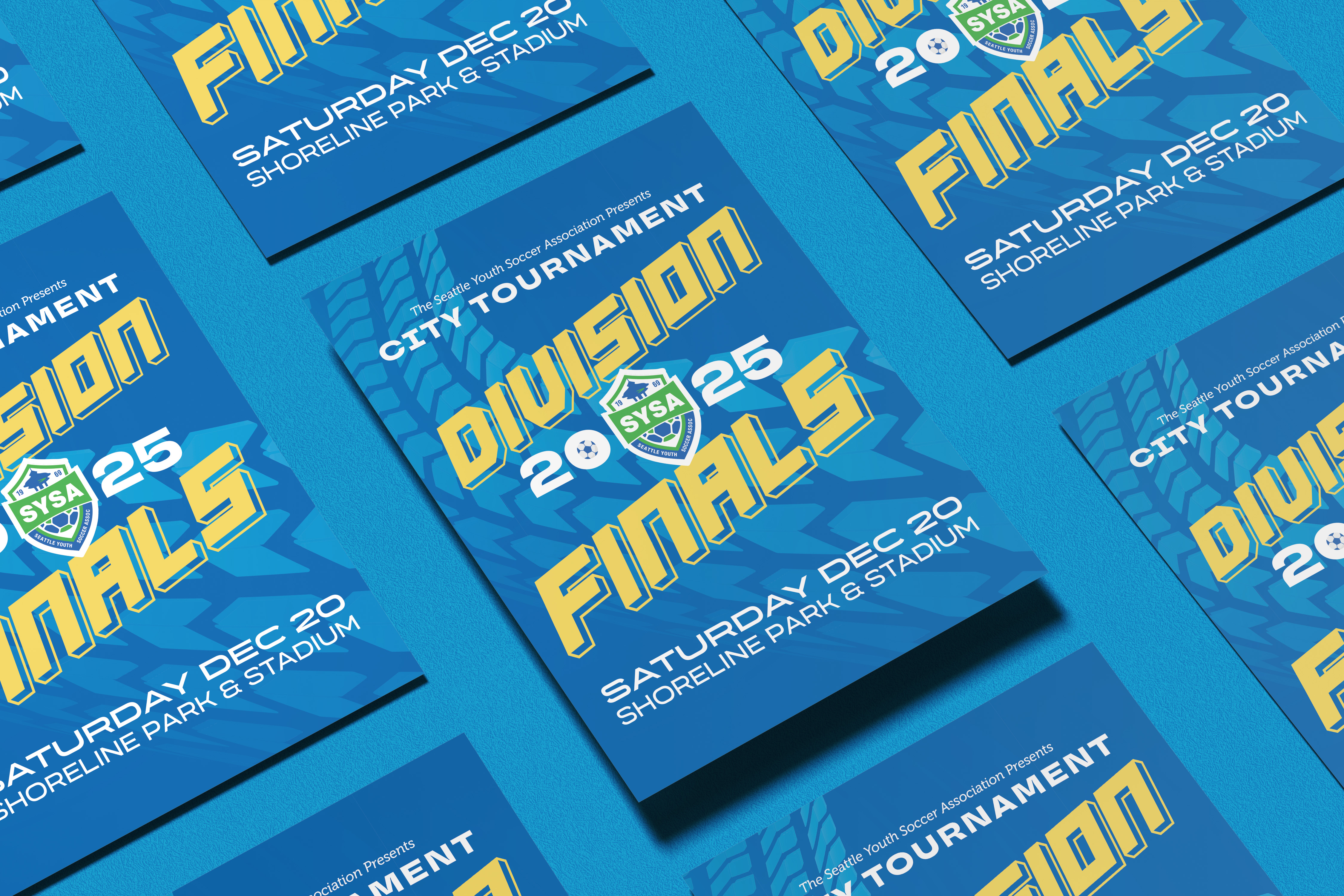
The Seattle Youth Soccer Association has been a cornerstone of youth athletics in the Seattle area since 1969, now serving over 12,000 young players. Their annual City Tournament Division Finals bring together local youth soccer teams competing for gold and silver medals—it's a huge event for the community. The program cover needed to capture all that energy and excitement, as it would be handed out to everyone in the stands and serve as a major part of the event's branding.
Client Vision
David, the SYSA official I worked with, had a really clear vision from our initial design consultation. He wanted something exciting, vibrant, and dynamic that would use the established brand colors—but with a twist. He specifically requested adding a gold or yellow accent that would bring the gold medal to mind and tie into what these young athletes were competing for. He knew what he wanted the end result to feel like, but gave me plenty of creative freedom on how to get there.
My Design Approach
I made a deliberate choice to avoid the typical sports design clichés—no silhouettes of kids kicking soccer balls, no literal imagery. Instead, I wanted to rely on strong typography and bold color to communicate the high-octane energy of a competitive soccer match.
The design centered on SYSA's vibrant blue as the background color, immediately establishing that brand connection. To suggest movement and momentum, I added an abstract arrow pattern graphic. It wasn't literal, but it conveyed speed, direction, and forward energy—exactly what you feel watching an intense soccer game.
The typography was where things got really fun. I used a complementary combination of four typefaces: Basset, TT Travels Next, Museo, and Organetto. Each brought something different to the table—some modern, some playful—but together they created a dynamic, energetic composition that felt youthful and exciting without being childish.
One strategic decision I made was keeping the SYSA logo front and center and making it the only element that used the brand's green color. This made the logo pop against all the blue and gold, ensuring instant brand recognition while maintaining visual hierarchy.
I created everything in Adobe Illustrator, which turned out to be the perfect choice for this project. When you're working with multiple typefaces, vector graphics, and experimenting with bold color combinations, Illustrator's flexibility is invaluable. Recoloring vectors and shuffling text elements around was incredibly smooth, which let me iterate quickly and explore different compositions.
Pushing My Comfort Zone
I'll be honest—bold, vibrant color combinations aren't usually my comfort zone. I tend to gravitate toward more subdued palettes. But this project demanded energy and vibrancy, so I pushed myself to embrace those bright, high-contrast choices. It was a fun challenge that helped me grow as a designer, and the final result proved that sometimes you need to step outside what feels natural to you.
The Result
David absolutely loved it. He actually called me a "star player" for nailing his vision, which was incredibly rewarding. The 850 printed programs were distributed at the Division Finals, and the cover became a memorable part of that year's event branding.
This project taught me that you don't always need literal imagery to capture the essence of something. Sometimes typography, color, and abstract elements can communicate energy and excitement more effectively than any photograph or illustration could. And sometimes the best growth happens when you push yourself into unfamiliar territory.