Overview
- Project Type
- Complete menu redesign
- Client
- Pizzeria 22 (artisan pizza restaurant)
- Tools
- Adobe InDesign
- Deliverables
- Print-ready files, printed menus
The Project
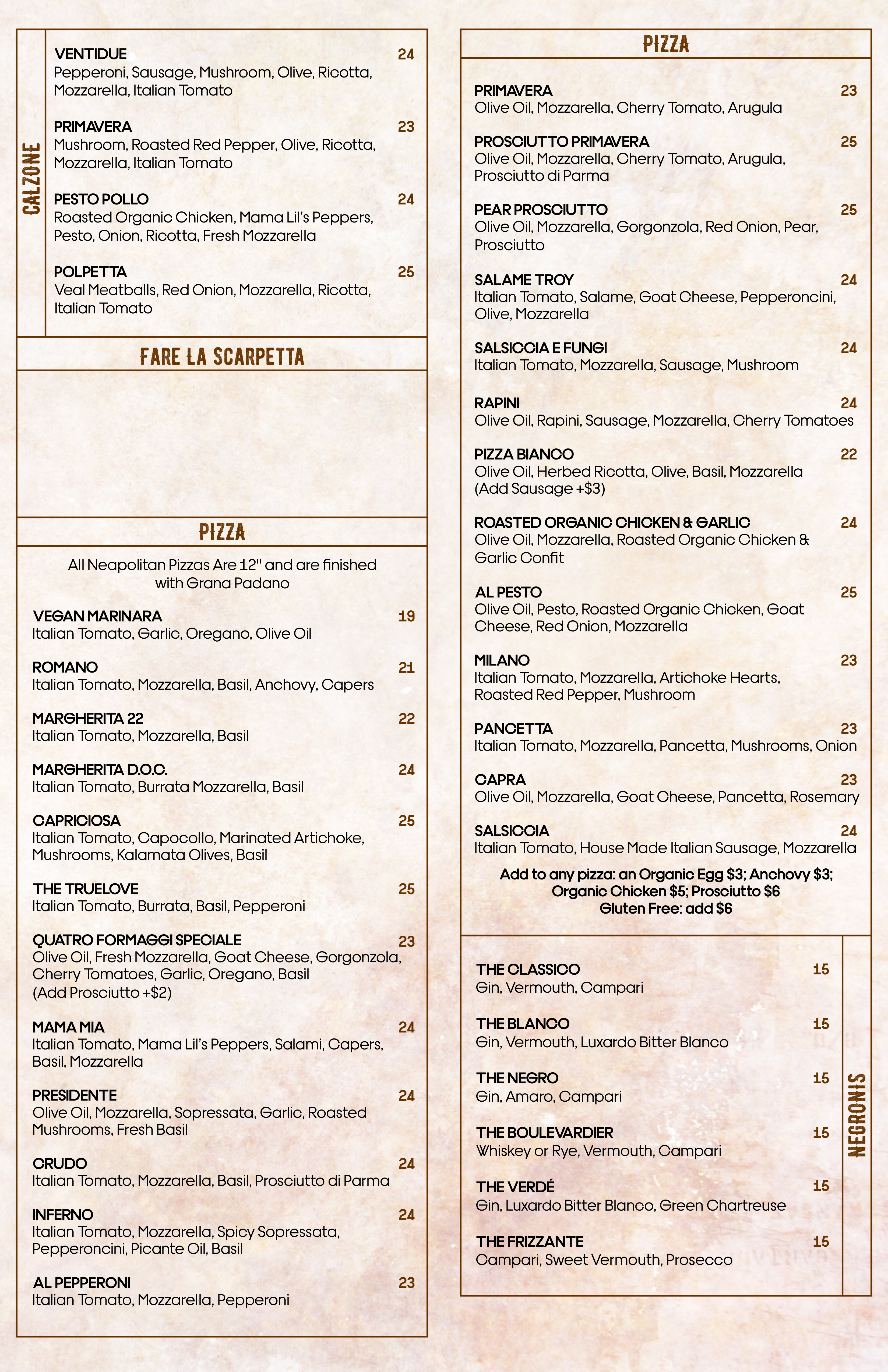
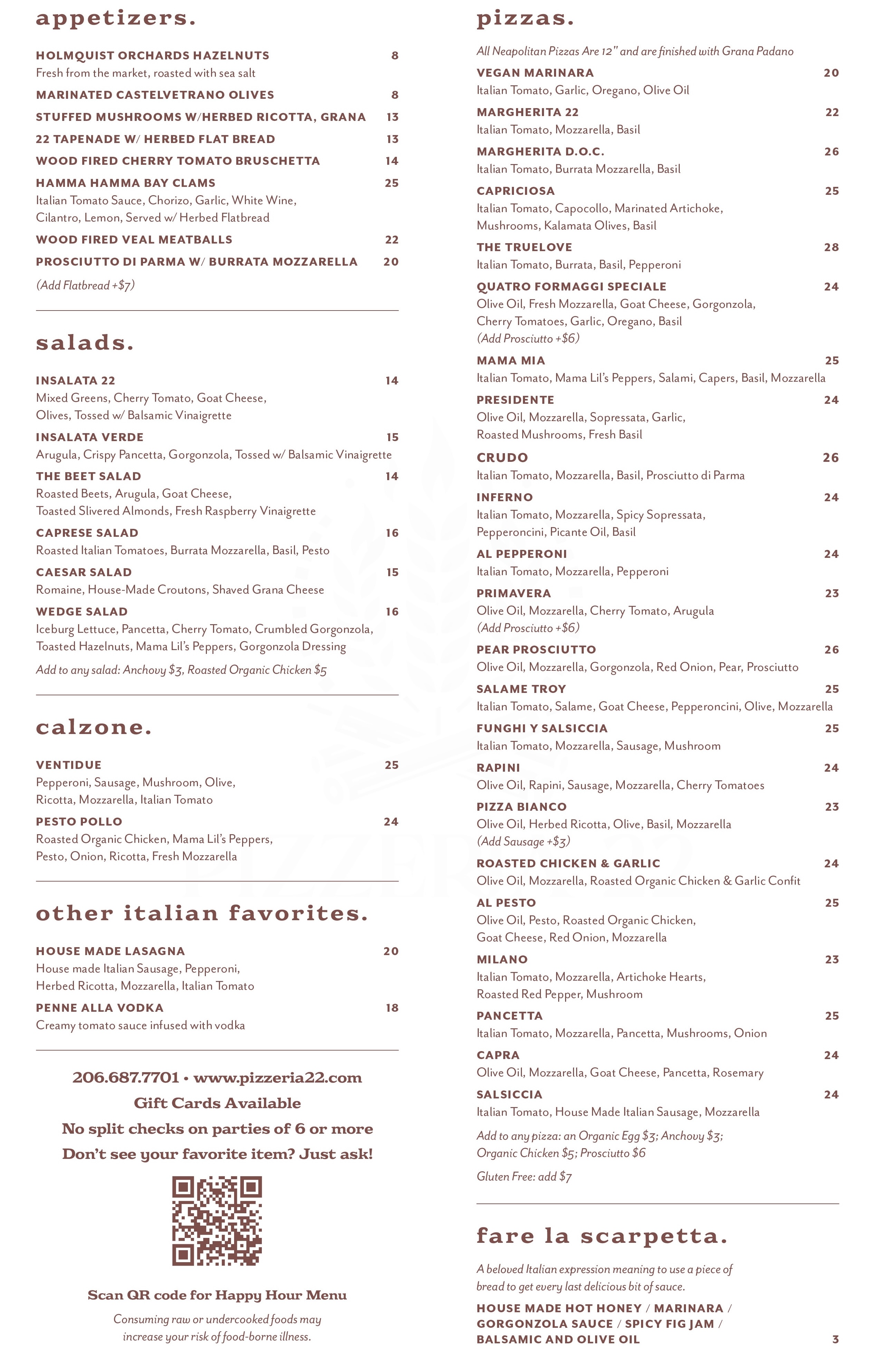
Pizzeria 22 is a luxe, artisan pizza restaurant serving elevated Italian cuisine — think wood-fired meatballs and prosciutto with burrata. But their menu didn’t match the quality of their food. The existing design was not ideal: fonts clashed, items were poorly aligned, whitespace was nearly nonexistent. It just didn’t fit the refined atmosphere Chef Brandi had created. The restaurant needed a menu that would reflect the care and craftsmanship that went into their food.
Design Challenge
Here’s what made this project particularly tricky: the menu had a massive amount of content. There were 23 pizzas alone, plus all the appetizers, salads, drinks, and other items you’d expect from a full Italian restaurant. The challenge wasn’t just making it look better — it was finding a way to present all that information without creating visual chaos or overwhelming diners.
Typograhy First
As a self-admitted type nerd, I knew typography would be the key to solving this problem. My approach centered on structure and minimalism, using typographic contrast to create clear organization without relying on heavy-handed design elements that would clutter the layout.
I chose the bold and chunky Eroika Slab set in lowercase for the section headings. It had the personality, drama, and presence to anchor each section and create visual interest. For the menu items themselves, I used Mr Eaves, a clean, contrasting sans serif that provided excellent readability and a more refined feel.
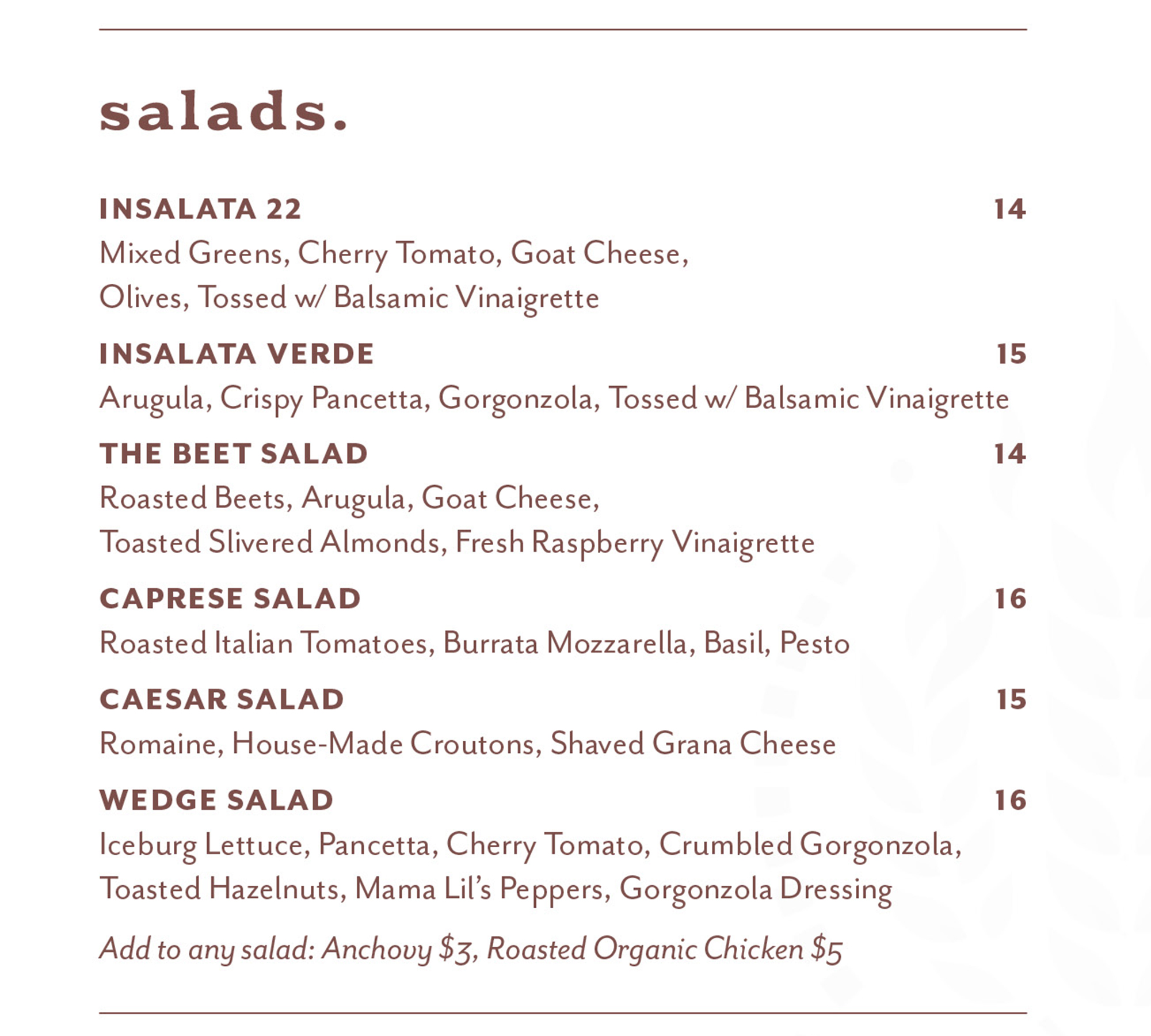
This typographic pairing did all the heavy lifting: the headings, menu items, and item descriptions became clearly distinguishable at a glance. Diners could navigate the extensive menu easily because the hierarchy was built into the type choices themselves, not added through extra design elements.
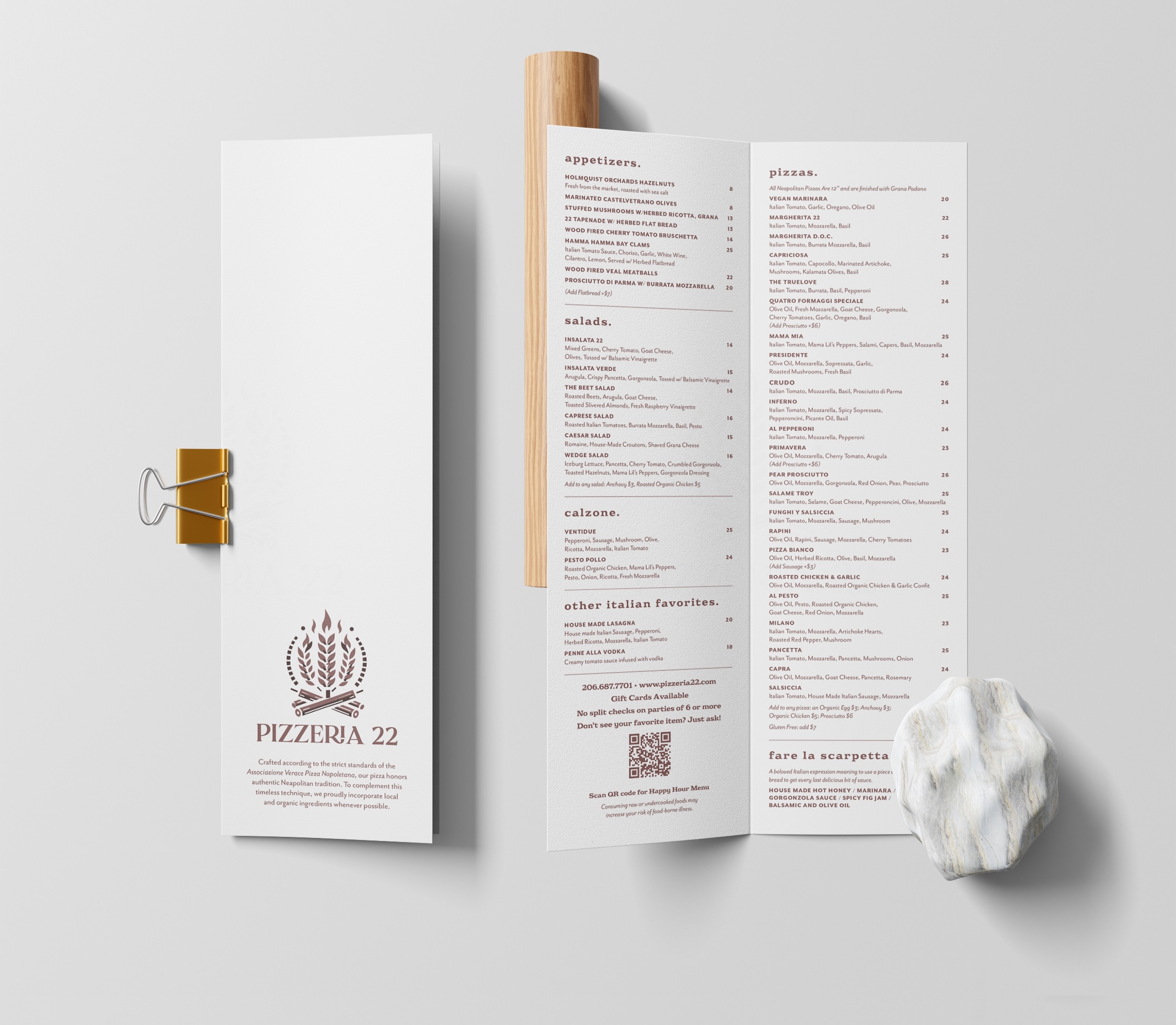
I worked entirely in InDesign for this project, which gave me the precise typographic control I needed. When you’re working with this much text and the design hinges on getting the typography exactly right, InDesign’s advanced type controls are invaluable. I could fine-tune spacing, alignment, and hierarchy with the precision the project demanded.
Working with Chef Brandi
Brandi and I had worked together before, which made this collaboration smooth and enjoyable. She trusted me to make the right design decisions and gave me plenty of creative freedom. That existing relationship meant she knew I understood her vision for the restaurant and could translate it into the menu design.
Problem-solving
The most challenging part was definitely finding a way to fit all that information into a clean, readable format. With 23 pizzas plus everything else, it would have been easy to let the menu become dense and overwhelming. The solution came through disciplined use of whitespace and a strong typographic hierarchy — every element had breathing room, and the type system made navigation intuitive.
As a typography enthusiast, I honestly had a blast with this project. There’s something deeply satisfying about using type to solve complex design problems, and this menu was the perfect playground for that approach.
Results
Brandi absolutely loves the new menu, and it’s currently in use at Pizzeria 22. Even better, her customers have been genuinely excited about the change, which tells me the menu is doing its job of enhancing the dining experience rather than just fading into the background.
This project reinforced my belief that great typography can carry an entire design. When you get the type right — the right faces, the right hierarchy, the right spacing — you don’t need much else. Sometimes the best solution is also the simplest one.
Move the slider to compare the old and new menus below!