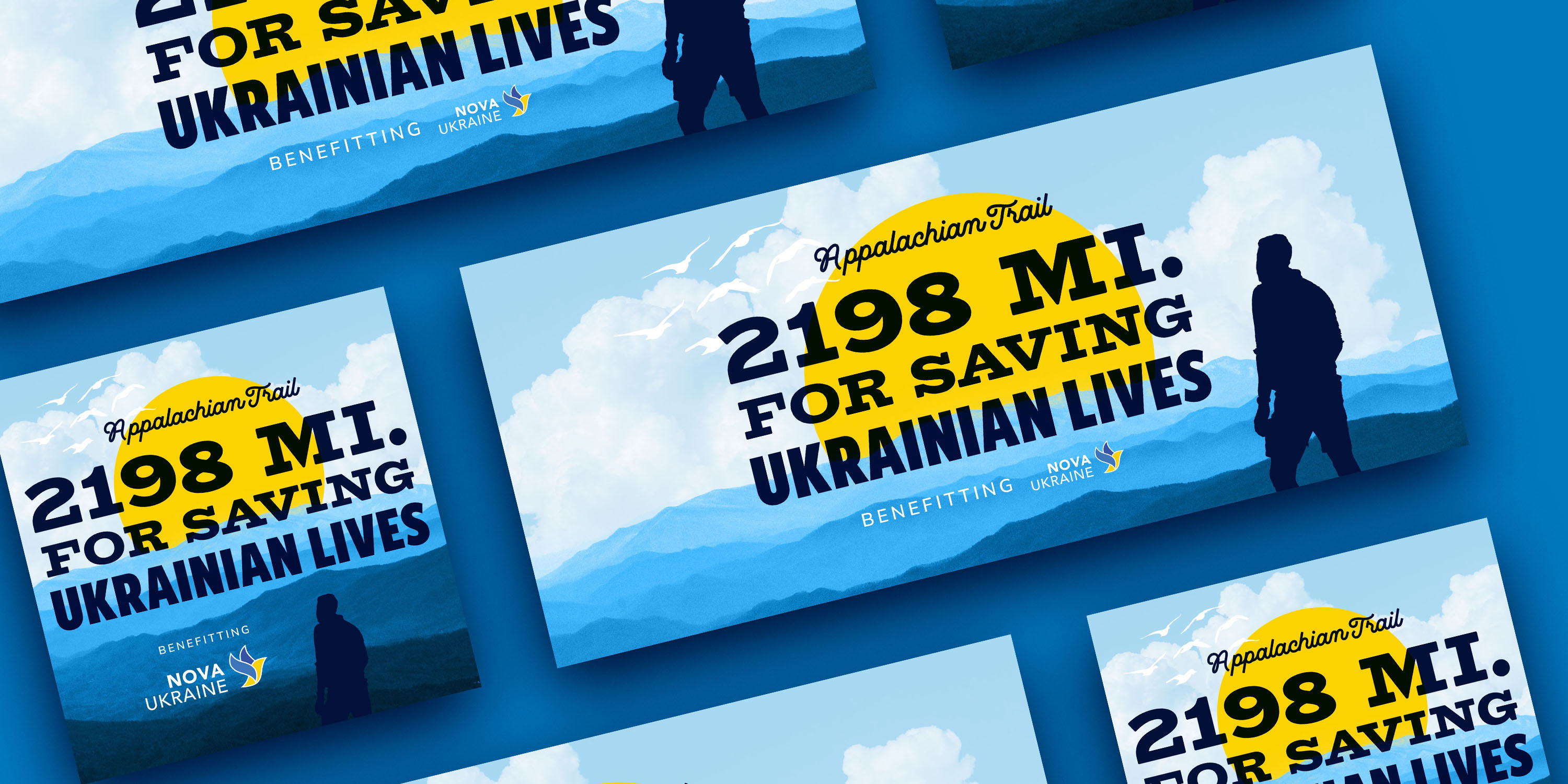
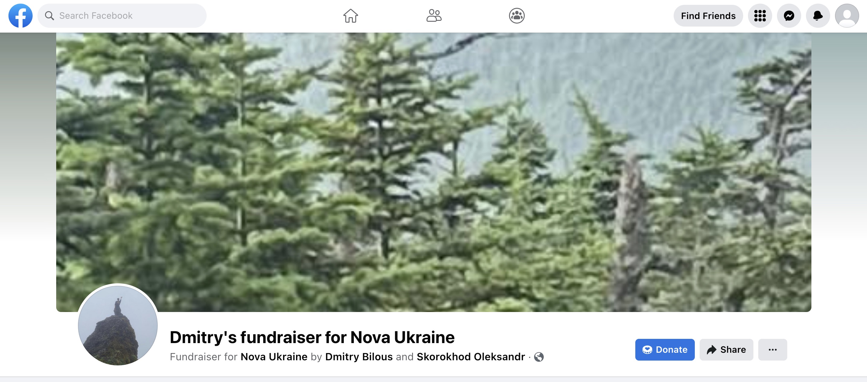
Humanitarian aid non-profit Nova Ukraine needed graphics to promote the charity hike “Appalachian Trail: 2198 Miles for Saving Ukrainian Lives”. Specifically, they requested a graphic to replace the existing Facebook fundraiser cover image (pictured below), as well as matching graphics for their email newsletter, website article, and social media posts.
Typography
For me, every design starts with typography. Vintage US national forest and park signage have an iconic typographic style, often mixing various kinds of lettering and typefaces to create a rustic, personable effect. Inspired by the aesthetic, I chose a friendly script typeface, an expanded slab serif, and a condensed humanist sans. In particular, the slab serif took a cue from the US National Park Service’s distinctive use of the classic typeface Clarendon.
The vastly different widths of the slab serif and the sans doesn’t just add energy to the composition; they also help build a hierarchy between different lines of text when I wanted the whole headline to be the same width.
Take a look at the example below. The words “Ukrainian Lives” should be highly emphasized — they’re certainly more important than “for saving” — but here, the impact is lost as the text scales down. Lines 1 and 2 appear to be the most important while line 3 looks less so.

In comparison, by using typefaces with different character widths, I could keep the text as one justified block while suitably emphasizing and de-emphasizing parts of the headline.

Imagery
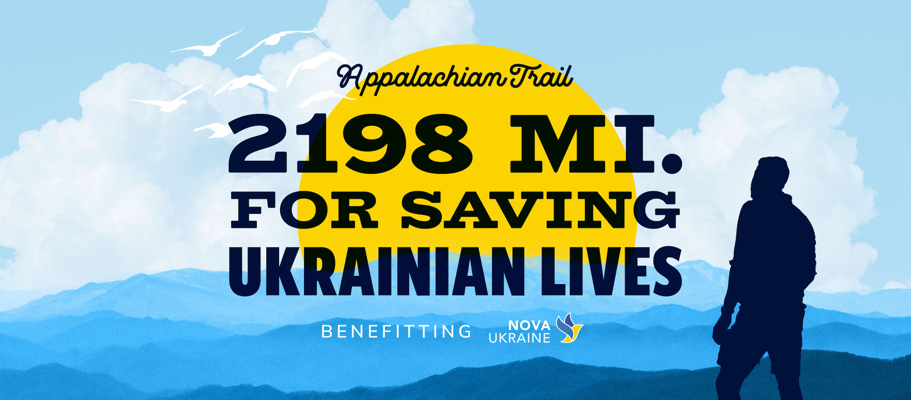
With only a few cell phone photos of the hiker available, I didn’t have a lot of material to work with. Thus I edited and composited several stock photographs, including the Great Smoky Mountains, dramatic clouds, and a hiker (Unsplash license) to create my design. All were adjusted to fit Nova Ukraine’s brand colors. Limiting the palette to blue, yellow, and white keeps things thematic — blue and yellow are instantly identifiable as the colors of the Ukrainian flag, while white (especially white birds) symbolizes peace.
The sun’s bright, contrasting color and central location help it draw the eye, guiding the viewer to the punchy headline text. Meanwhile, the hiker and the birds are placed diagonally across from each other, with the text in between. This helps balance the composition and add visual interest. In addition, the hiker provides context to the image: it is as though we, the viewer, are hiking just behind him, gazing out at the beautiful landscape of the Appalachian Trail.
Outcomes
The graphics I designed and produced were used across various channels, including Nova Ukraine’s Facebook (112K followers), Instagram (17K followers), email newsletter (5K+ subscribers), and website.