
Overview
- Project Type
- Book cover design and interior typesetting
- Client
- Self-publishing author
- Tools
- Adobe Photoshop, Adobe InDesign
- Deliverables
- Print-ready PDFs, ePub file, promotional materials
Dr. Len Fellez, Ed.D., came to me with an idea in his head and a manuscript in his hand. After a life filled with twists and turns — from a rough-and-tumble childhood in Hawai'i suffering from poverty, systematic racism, and abuse to becoming a school principal dedicated to caring for the kids who needed care the most — he had written his memoirs and was ready to self-publish. He wanted his 113,000-word (nearly 500-page!) book typeset and, just as importantly, he wanted a cover design that would catch the eye of prospective readers.
Process
I started by sitting down with Len for extensive consultations and then diving deep into reading his manuscript. I needed to understand not just what happened, but how it felt. The memoir was gritty and emotionally heavy, dark at times, but also full of beautiful cinematic moments — like when he finally gathered the courage to ask out his now-wife. That emotional landscape became the foundation for every design decision I made.
Working closely with Len throughout the design process, I benefited from his willingness to provide creative freedom while offering clear direction about his vision and the book’s core themes. This collaborative approach resulted in a design that authentically captured the story’s essence and exceeded his expectations.
Cover Design
For the cover, I wanted to visually represent Len’s transformation, so I created a composite image in Photoshop that showed him both as the principal he became and as the child he once was. The main color palette centered on a desaturated blue that evoked both the Hawaiian ocean from his childhood and set that somber, reflective mood the story called for.

For drama and visual impact, I used a bright yellow-orange accent color for the title. I chose a bold, dramatic font that reminded me of 1980s thriller novels (the aptly-named Thrillers) — it had the emotional intensity the book deserved. Then I distressed the title in Photoshop to add texture and grit, reflecting the raw, authentic nature of Len’s story.


Interior Design
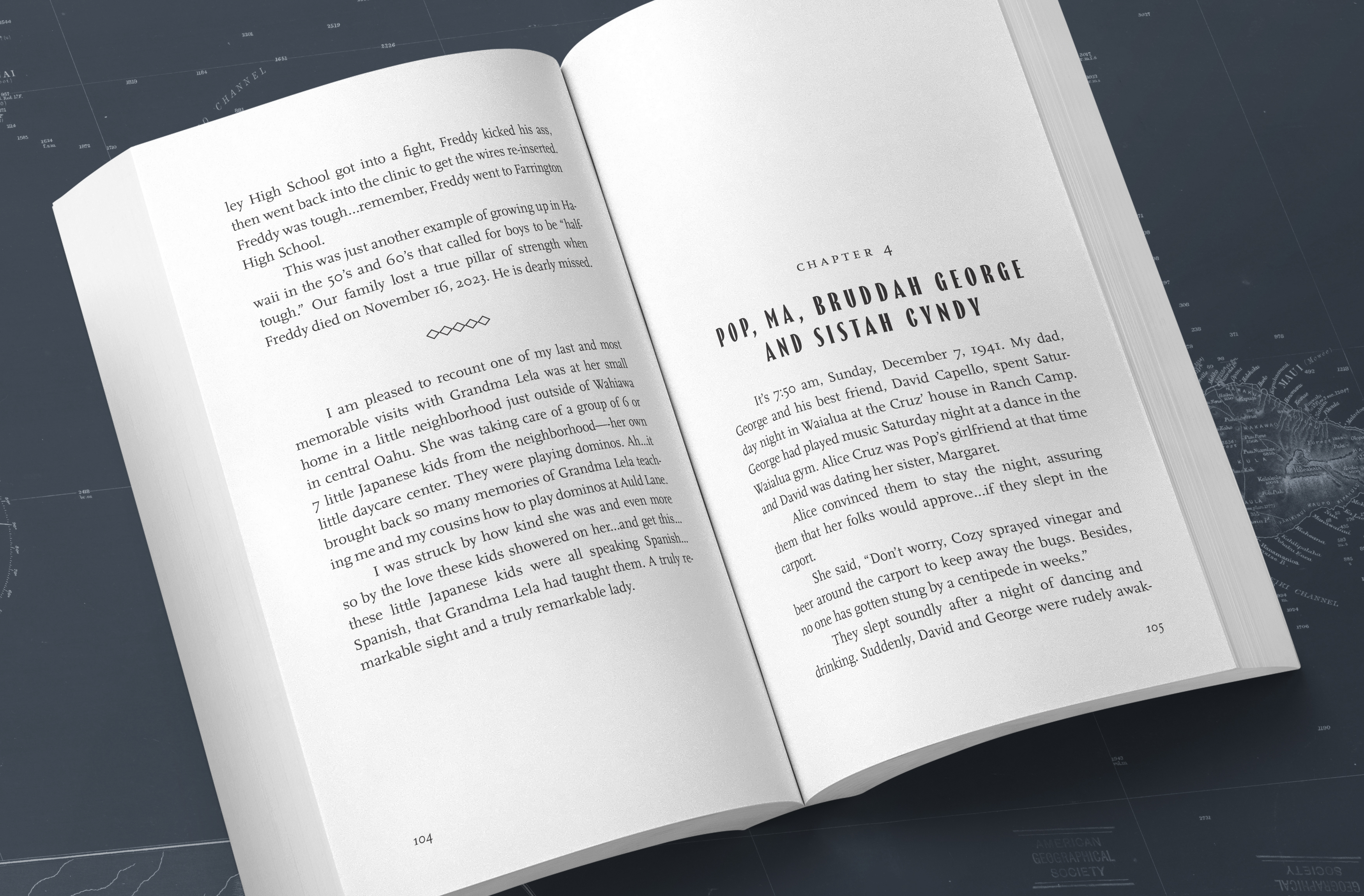
For the interior, I prioritized readability above all else. I selected a clean serif typeface and gave the pages plenty of whitespace — this story was heavy enough without cramping it visually. For chapter titles, I used the same dramatic font from the cover to create continuity and maintain that established personality throughout the book.
Working with Len
Len was honestly a dream client. He gave me incredible creative freedom while providing clear direction about his vision and the book’s core themes. Our collaboration felt natural—he trusted my design expertise while I made sure every choice honored his story. When I showed him the final design, he said it captured the story perfectly, which meant the world to me.
Results
I delivered all the files Len needed: print-ready PDFs, ePub formatting for Kindle Direct Publishing, and additional promotional materials like marketing flyers. The book launched successfully, and Len was thrilled with how it turned out. The best part: he’s come back to work with me on more of his books, which tells me I really understood what he was trying to accomplish.