Overview
- Project Type
- Complete menu redesign and promotional materials
- Client
- A Pizza Mart (local pizza restaurant)
- Tools
- Adobe Photoshop, Adobe Illustrator, Adobe InDesign
- Deliverables
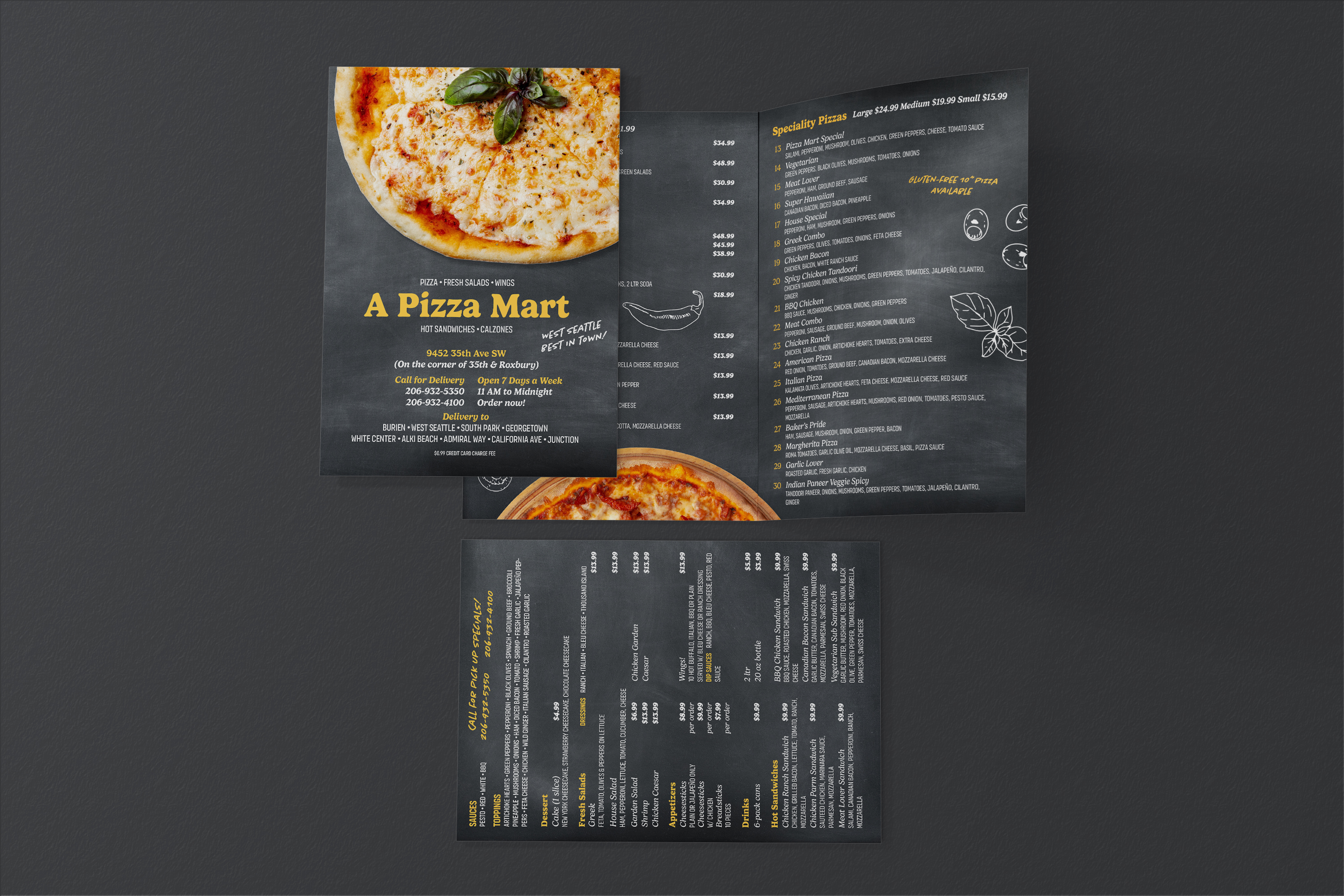
- Print-ready takeout menu, window posters, promotional materials
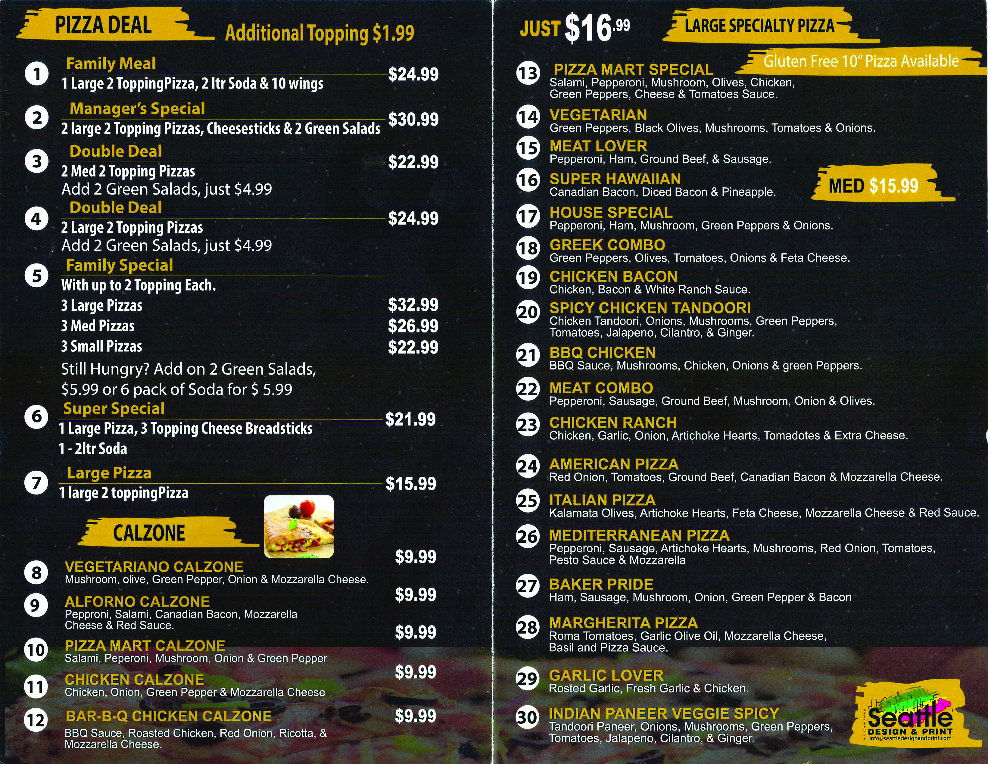
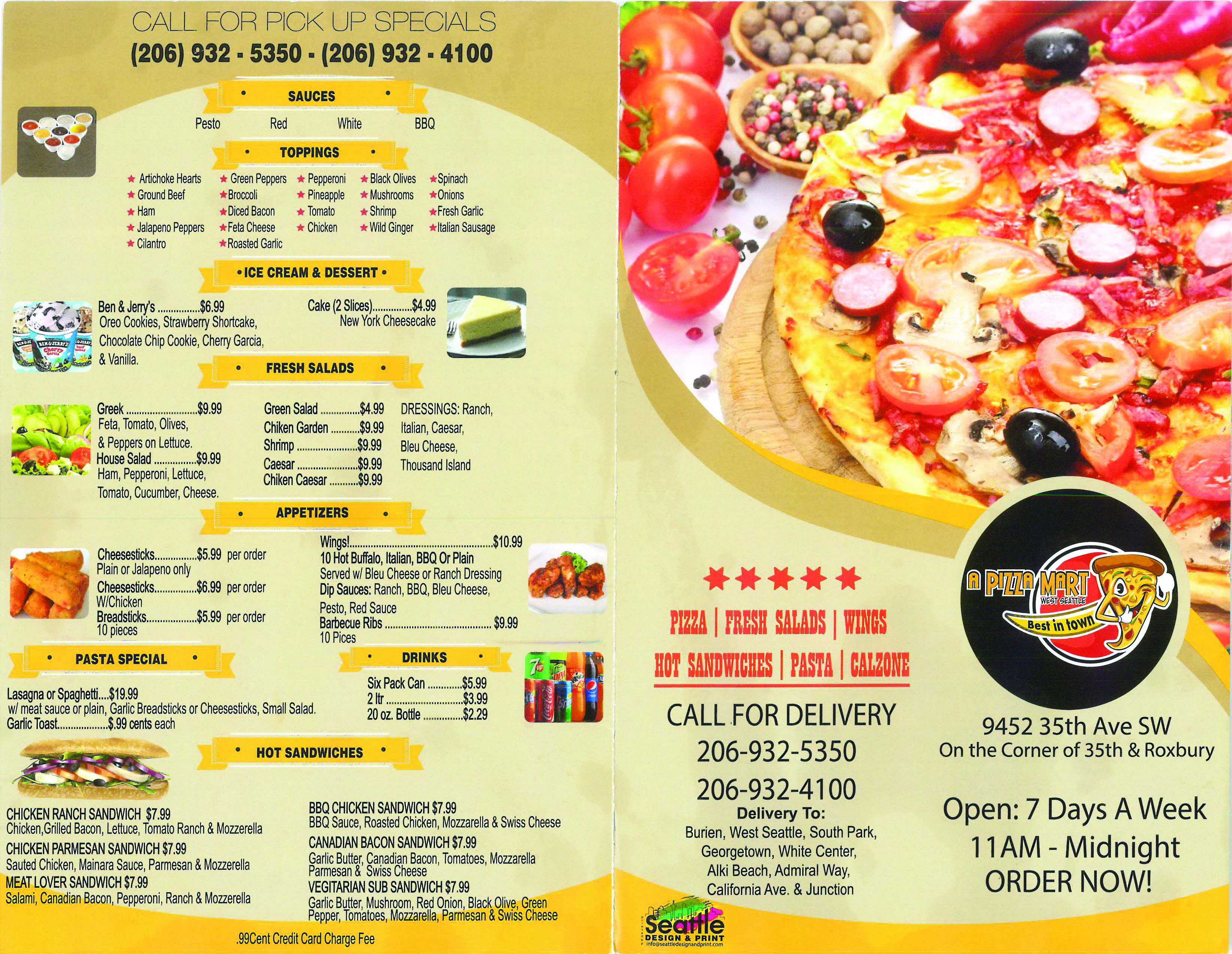
Parwinder, owner of local American-Indian fusion pizza restaurant A Pizza Mart, approached me for a redesign of her menu. It had a smorgasbord of delicious offerings (thirty specialty pizzas—thirty!), but the design was cramped and rather dated. I felt confident I could improve it with a style refresh and by using typography to create a clear information hierarchy.
Design Approach
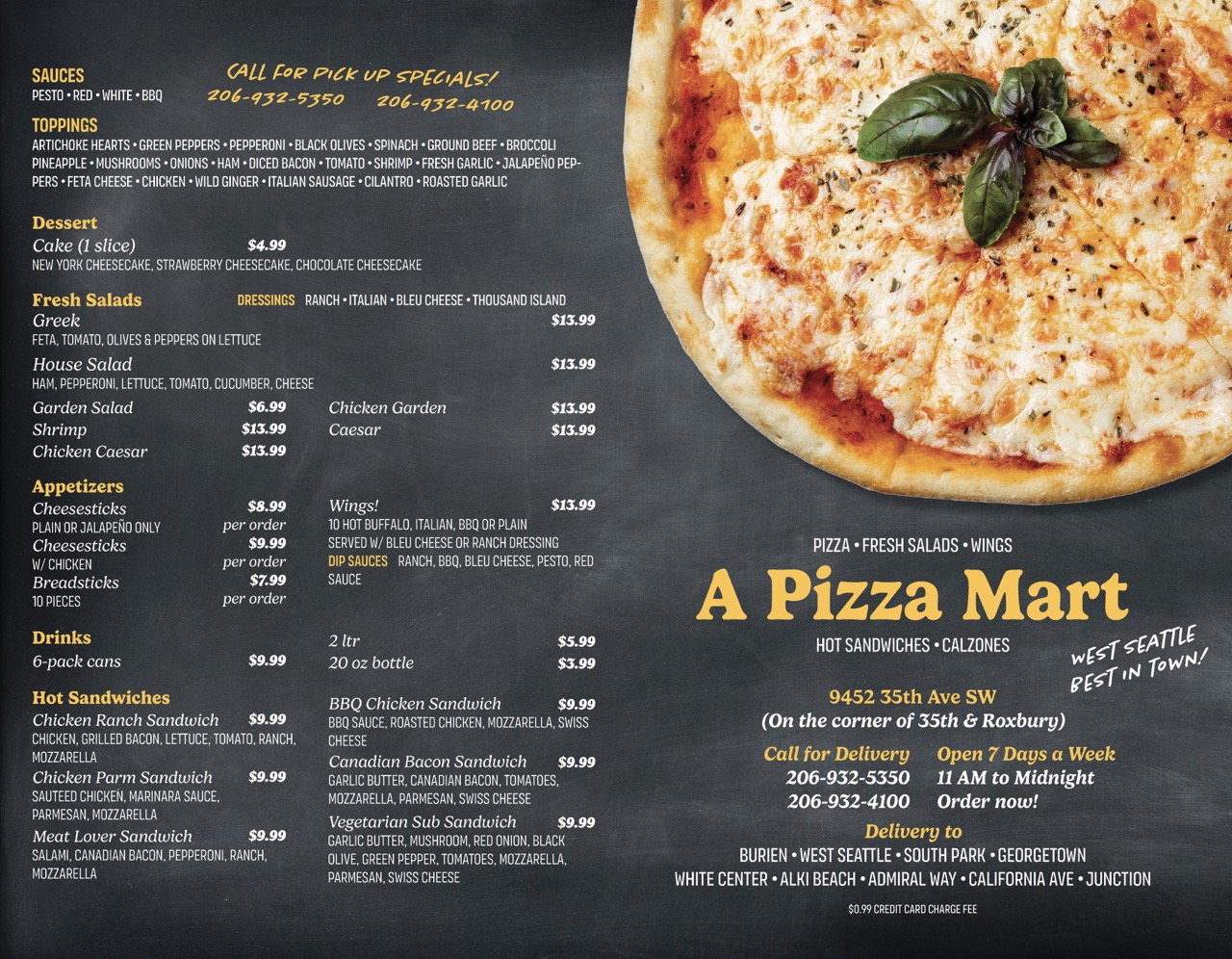
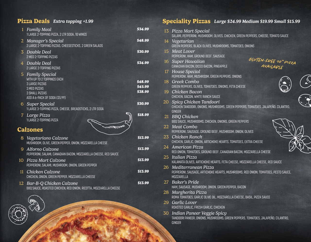
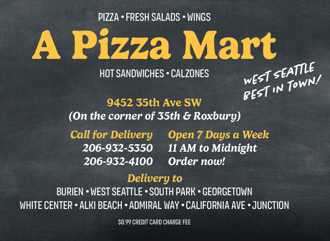
I decided to go with a classic chalkboard menu concept. It felt authentic and warm, perfect for a family-owned pizza place, and gave me a strong visual framework that could handle all the content without feeling cluttered. The chalkboard theme also let me mix food photography with chalk-style line art, which added visual interest throughout the menu.
I kept the color palette simple and authentic: traditional black and white like a chalkboard, with strategic pops of bright yellow for key headings and callouts. The real color came from the food photography, which I isolated in Photoshop to make sure each image showcased the food.
I chose typefaces with personality that reinforced the brand's personable character while ensuring everything stayed super readable. The key was creating a clear hierarchy—using different font weights, sizes, and the yellow accent color so customers could quickly scan categories, items, and prices without getting lost.
Working with the Client
Parwinder gave me tons of creative freedom, which was fantastic. Her main concern was keeping all the existing content, but beyond that, she trusted me to transform how it was presented. That kind of trust from a client makes all the difference — it let me make bold choices that really elevated the final result.
Results
The transformation was dramatic. We went from a generic, hard-to-read menu to something with real personality and professional polish. Parwinder was thrilled with how it turned out, and I was able to extend the design system to window posters and other promotional materials, giving A Pizza Mart a cohesive brand presence.
Move the sliders to compare the old and new menus below!