Overview
- Project Type
- Custom lettering and bookmark design
- Client
- University of Washington Advancement
- Tools
- Procreate, Adobe Photoshop
- Deliverables
- Print-ready files, 500 printed bookmarks
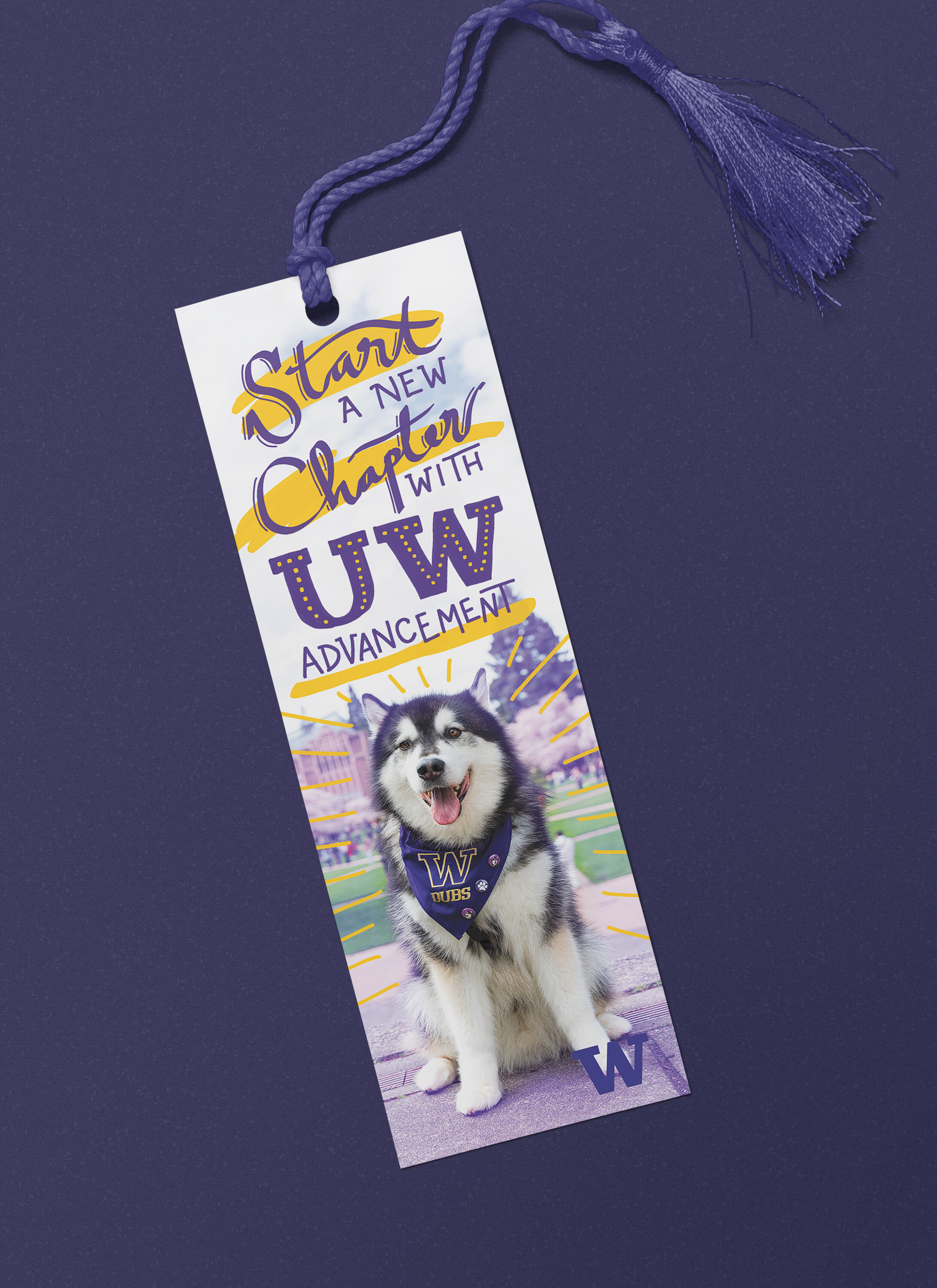
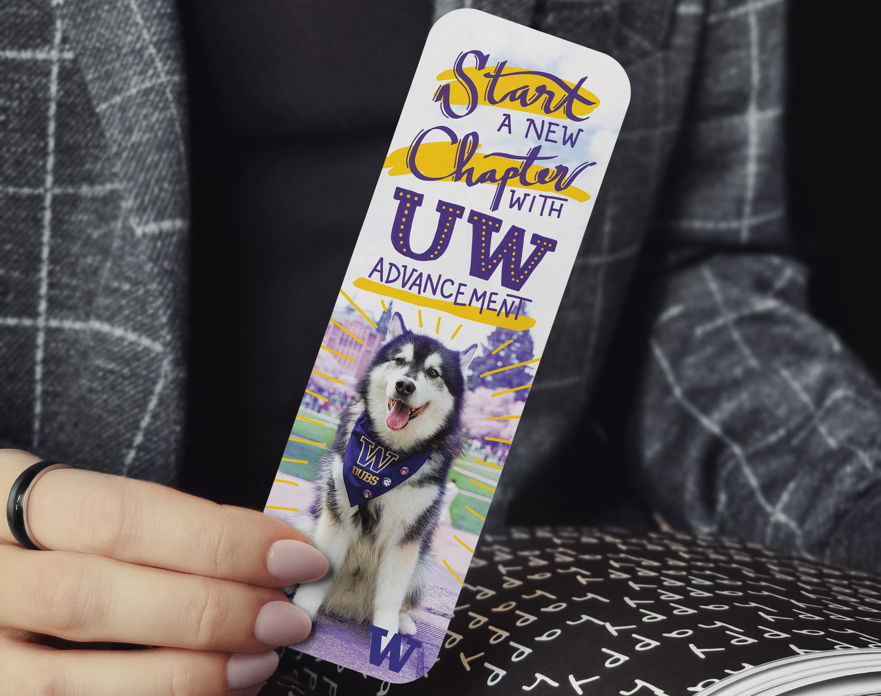
The University of Washington Advancement team came to me needing an engaging promotional bookmark for career fairs, conferences, and employee onboarding events. They wanted something that would attract working professionals in nonprofit and university fundraising while showing off the energy and opportunity of joining their team. The big challenge would be creating something that would, in the client’s words, “stop someone in their tracks when walking by a booth” while still looking professional and staying true to university brand standards.
Brief & Challenges
UW Advancement was really clear about what they wanted: playful and spirited, but not unprofessional. Their audience was experienced fundraising professionals who would appreciate creativity but also expected institutional credibility. They wanted to avoid overdone themes and wanted something that would actually engage people.
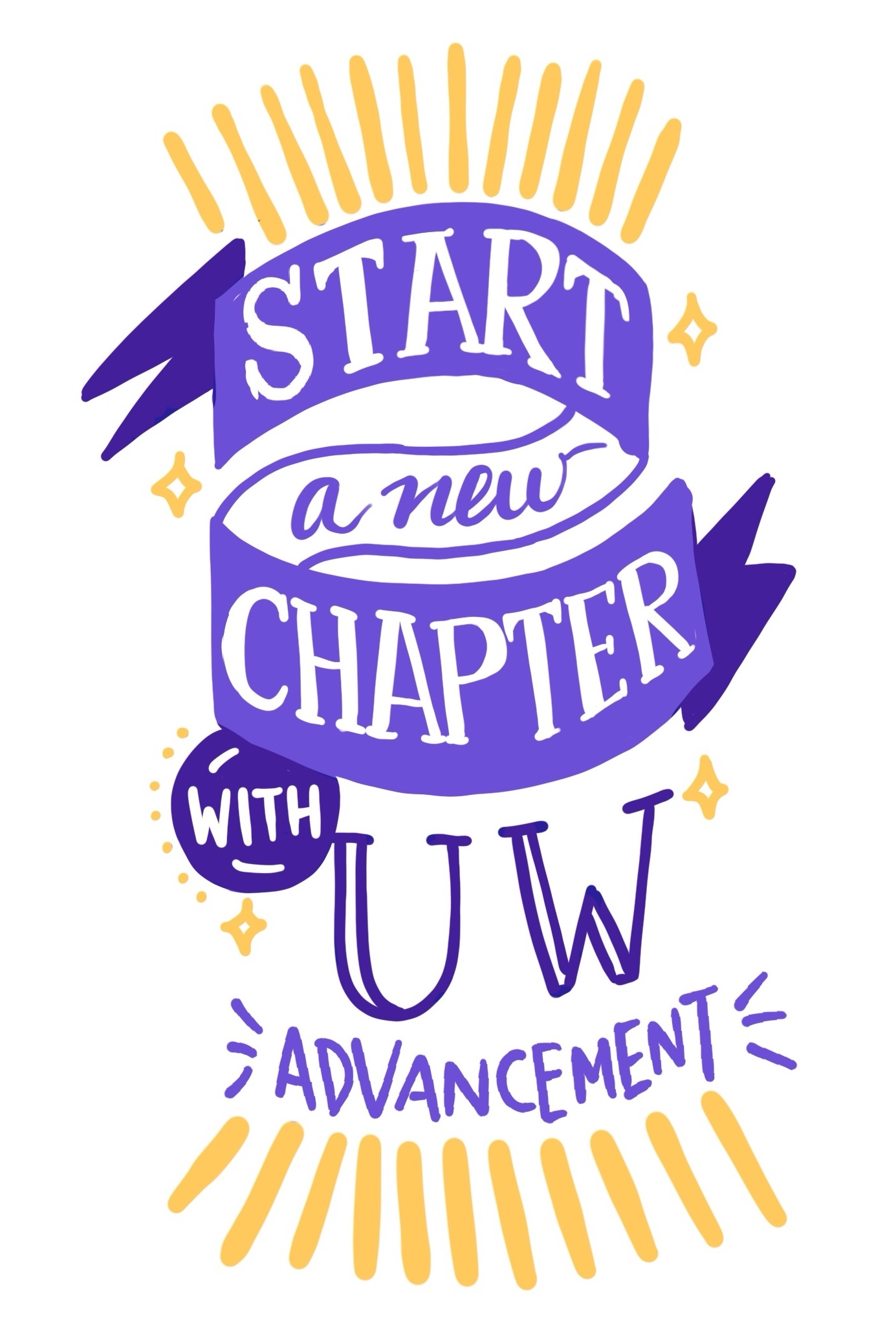
The message “start a new chapter with UW Advancement” was perfect – a clever play on both the bookmark format and the career opportunity. I knew this phrase could be the foundation for some really expressive custom lettering that would set this piece apart from anything using standard fonts.
The trickiest part was definitely finding a balance between playful and professional. I needed to create something memorable and engaging without losing the institutional credibility that experienced fundraising professionals would expect. The solution came through working closely with the client and iterating – moving away from my original cartoon concepts toward something more sophisticated that still had personality.
Working within UW’s brand guidelines while creating something fresh required me to really understand their visual identity standards and find creative ways to apply approved elements in new ways.
Lettering
I decided to mix three different typographic styles to create visual energy and keep things interesting:
- Script elements for warmth and personal connection
- Slab serif components to show institutional strength and professionalism
- University logotype integration to stay on-brand with official UW typography
I hand-drew everything in Procreate, which let me create organic relationships between letterforms and make custom adjustments that you just can’t get with regular fonts. The mix of styles created a dynamic visual rhythm while keeping everything totally readable on the small bookmark format.
Graphics
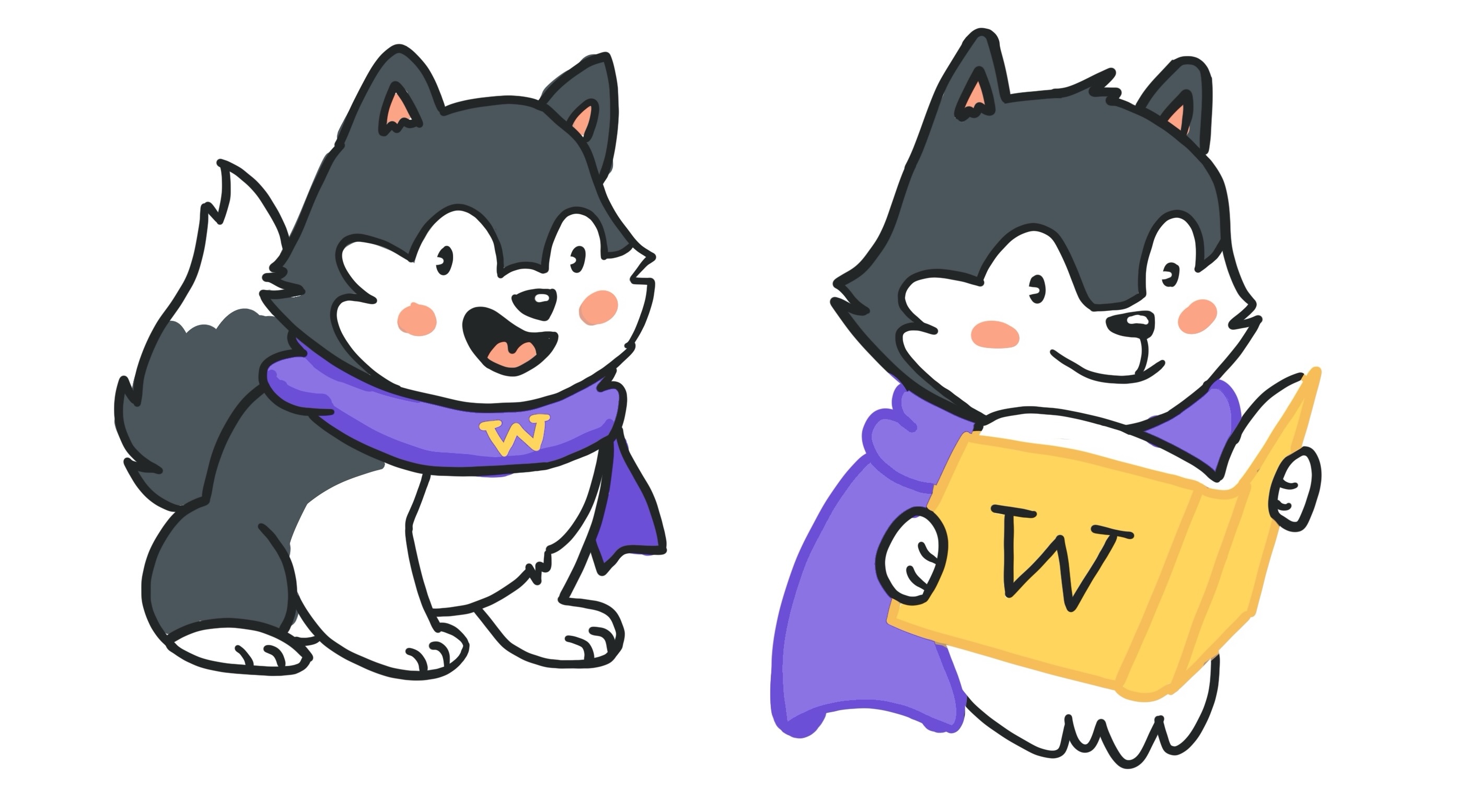
Beyond the lettering, I included a photograph of Dubs, UW’s live husky mascot, shot right on campus. This actually came out of some trial and error – my initial cartoon husky sketches got rejected for being too playful, so we pivoted to authentic campus photography that hit the sweet spot between fun and professional.
I pulled everything together in Photoshop, adjusting colors and refining the layout until the lettering and photography felt like they belonged together. The goal was integrating my custom lettering with university brand colors and the photo in a way that felt cohesive and energetic.
Results
The bookmark successfully gave UW Advancement an attention-grabbing recruitment tool they wanted while maintaining the professional credibility they needed. My custom lettering created distinctive personality that would stand out at busy career fairs and conferences, while using Dubs and campus imagery kept the authentic university connection.